A good website design is crucial for amusement parks and attractions as it serves as the first point of contact for potential visitors. A well-designed website can provide a positive and immersive user experience, showcase the park’s attractions and make it easy for visitors to plan and purchase tickets online for their visit.
Also, a good website design can help the venue stand out from the competition and help to attract a wider audience.
On the other hand, a poorly designed website can turn potential visitors away, impacting the park’s overall success. It can also make it difficult for visitors to navigate and plan their visit, leading to frustration and potential guests leaving the website
Overall, a good website design is crucial for amusement parks and attractions to succeed in today’s digital age.
What are the key elements of a good amusement park and attraction website?
Eye-catching design that makes browsers want to visit
The website design of an amusement park should be visually attractive and appealing to the target audience, using high-quality images and videos that showcase the park’s attractions. The website should give users an immersive experience that creates a desire to visit the park. The design should be consistent with the branding and messaging of the park.
Clean design that is easy to navigate
A clean and clutter-free design is essential for an amusement park website. The navigation should be intuitive and easy to use, and the website should be organized with clear sections and headings that guide users to find what they are looking for quickly. The website should be designed with the user experience in mind, making it easy for users to complete desired actions, such as buying tickets or finding directions to the park.
Key information that is easy to find
It is important for an amusement park website to provide essential information such as opening hours, ticket prices, attraction information, and directions to the park in a clear and concise way. The website should include a FAQ section that covers commonly asked questions and addresses any potential concerns that users may have. The information should be updated regularly to reflect any changes or updates.
Online tickets that are easy to purchase
One of the primary functions of an amusement park website is to make it easy for visitors to purchase tickets online. The website should have a clear and easy-to-use ticketing system that allows users to select the date and time of their visit, choose the type of ticket they want, and pay securely. The process should be streamlined, fast, and error-free to avoid frustration and lost sales.
Integrations with social media to show happy guests
Amusement park websites should have social media integration, allowing visitors to share their experiences and promote the park to others. Social media feeds and reviews from happy guests can help build trust and encourage more people to visit the park. The website should also have links to the park’s social media pages to make it easy for users to follow and engage with the park online.
Mobile responsive
A mobile-responsive website design is crucial for an amusement park website. The majority of visitors will access the website from their mobile devices, so it’s essential that the website is optimized for smaller screens and mobile browsers. The website should have a responsive design that adjusts to the size of the screen, loads quickly, and provides a seamless user experience on mobile devices.
Best Amusement Park and Attraction Website Designs Around the World
Super Nintendo World
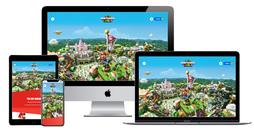
Whether you’ve recently seen the Super Mario Bros. movie, or you’ve played one of the many games that have been made throughout his long lifespan, chances are you know about Mario and Nintendo.
Well, they also have a theme park, and their website shows the same kind of UI mastery that Nintendo has applied to all of their consoles. The best way to describe this website would be “simple, yet dynamic”.
The images are detailed and full of movement, paired with an array of eye-catching colors. It’s impossible to look at this website and get bored. But, it’s also incredibly simple to navigate. Information is spaced out adequately and easy to read.
The Official Saw Escape Las Vegas
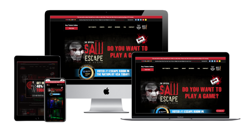
Now, we’re on the other side of the spectrum when it comes to movies. Perhaps, you’re in the mood for something a little more intense, and what’s more intense than the Saw movies?
If the official Saw-themed Escape Room in Las Vegas sounds like your cup of tea, the website definitely won’t discourage you. The website’s layout is fairly standard, but the media that populates the page has been made to evoke the tone and feeling of the franchise in a truly immersive way.
The cherry on top has to be the little cassette tape in the top right corner. Fans of the franchise will recognize that imagery from the films, and clicking it gives you a little introductory message from the Jigsaw Killer himself (voiced by franchise mainstay Tobin Bell).
The Gunpowder Plot
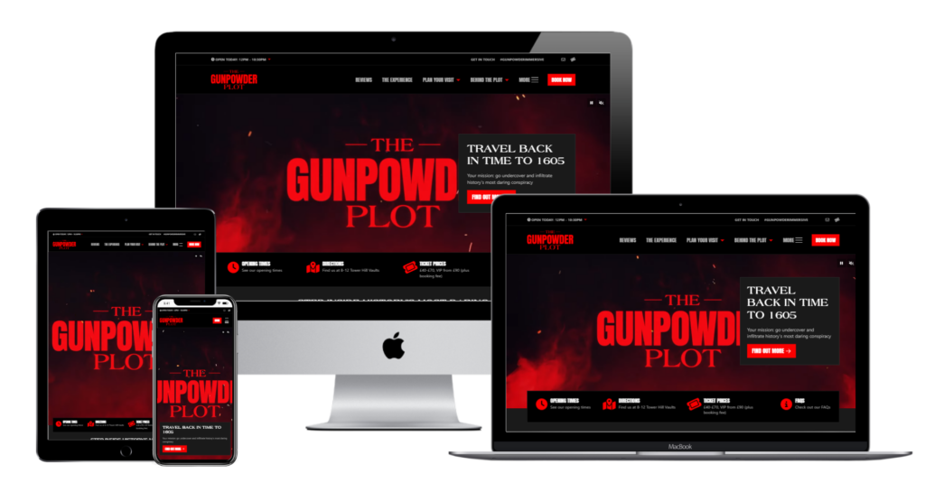
Now, we’re done with movies, but we’re moving onto an experience that might as well be a movie. The Gunpowder Plot is a theatrical experience that takes place in the UNESCO World Heritage Tower of London concerning Guy Fawkes and his 1605 plot to blow up Parliament.
While the website isn’t particularly explosive, it is certainly eye-catching. You’re greeted immediately with a short making of video that shows all kinds of alluring details, from the elaborate sets, to the professionals working on the project, to brief glimpses of the story that you are going to be involved in, should you choose to take part in this attraction.
From there, the site’s well-structured layout makes it easy to learn more, plan your visit and book tickets.
Beyond King Tut
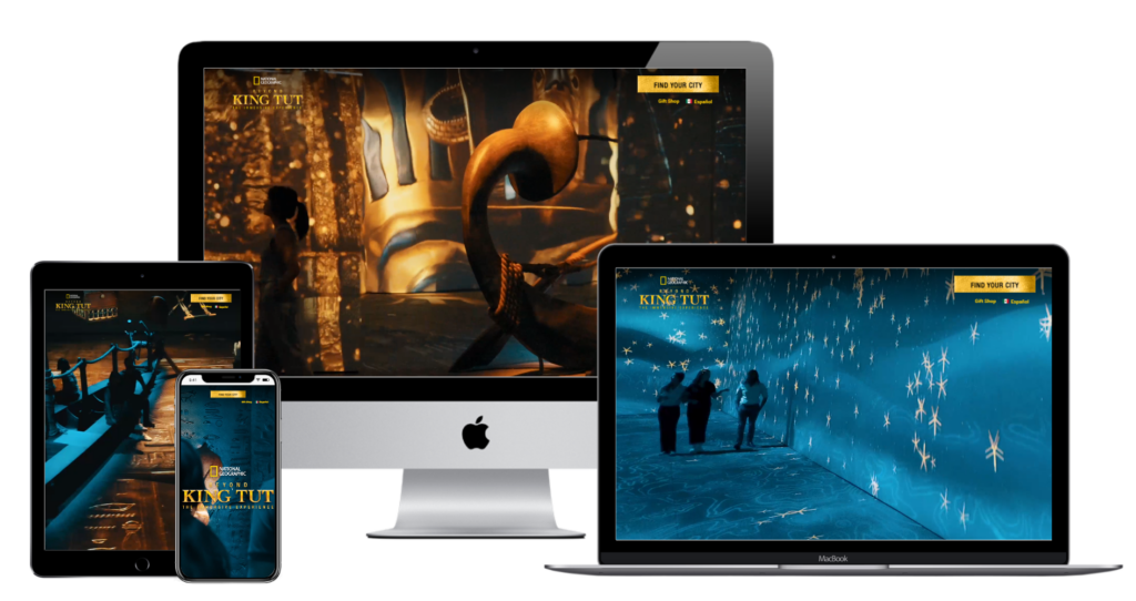
What if you’re not in the mood for 1605 London, and Ancient Egypt is more your speed? National Geographic has you covered with Beyond King Tut, a museum exhibition on steroids, with nine distinct multisensory galleries that depict the 3300-year-old story of King Tutankhamen.
Like with the previous website, the big centerpiece of this website is an incredible video that shows the elaborate attraction amidst a dazzling display of colors and lights. Once you’re wowed by the sensational video, all you have to do is find your city (by picking the skyline, which is certainly novel and beats plain buttons), and then you have easy access to all the information you need to buy a ticket.
Aerobanquets
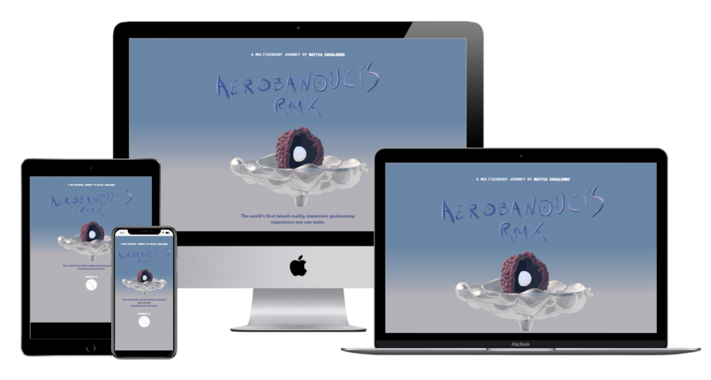
Billed as “the world’s first mixed-reality, immersive gastronomy experience you can taste”, Aerobanquets is a futurist art-installation and dining experience rolled into one.
Given the surreal nature of this attraction, it’s important that the website conveys enough information that the user knows what they’re signing up for, but not too much that it spoils the experience or is too dry to read.
That is where this website truly flourishes. Through its use of contrasting colors and intriguing absurdist imagery (including the image at the top, which bounces up and down when you roll over it), this website gives you a feeling of what to expect from this experience.
Luna Luna
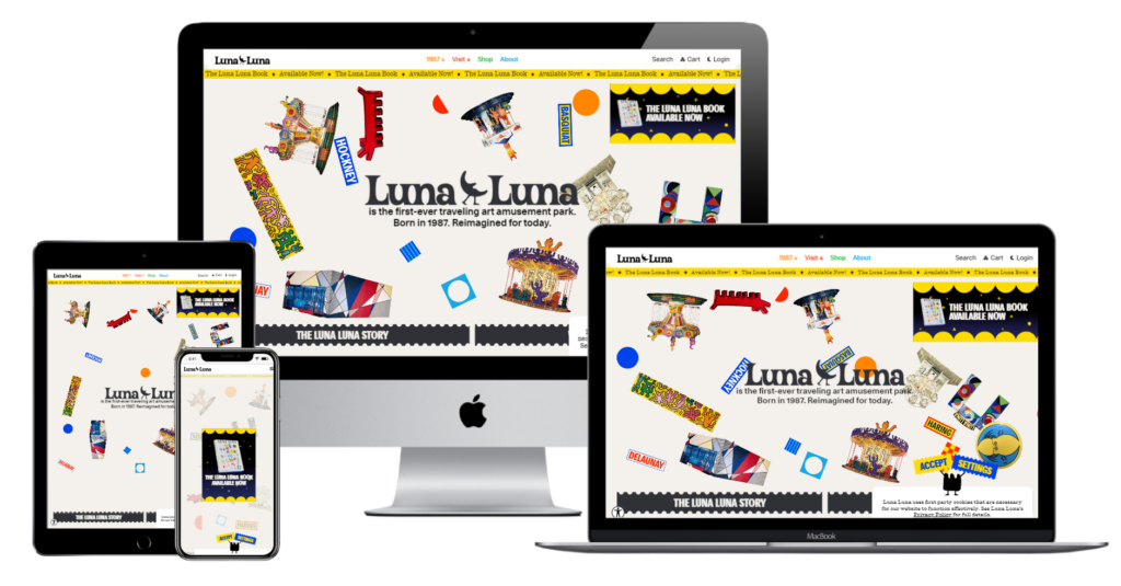
If this carnival is half as fun as its website is, then sign me up. Every part of this website is dynamic and colorful, and there are so many aspects that you can click on and play around with (no, I won’t spoil them. Check out the website and see).
It’s one thing for a website to have all of its information laid out plainly. It’s another thing entirely for a website that uses artistic conventions that make you want to explore. The website is an experience in and of itself.
It also helps that, via a small icon in the bottom left corner of the site, you can access a ton of accessibility settings that make the website easier to use. It doesn’t get much better than that.
Arcadia Earth
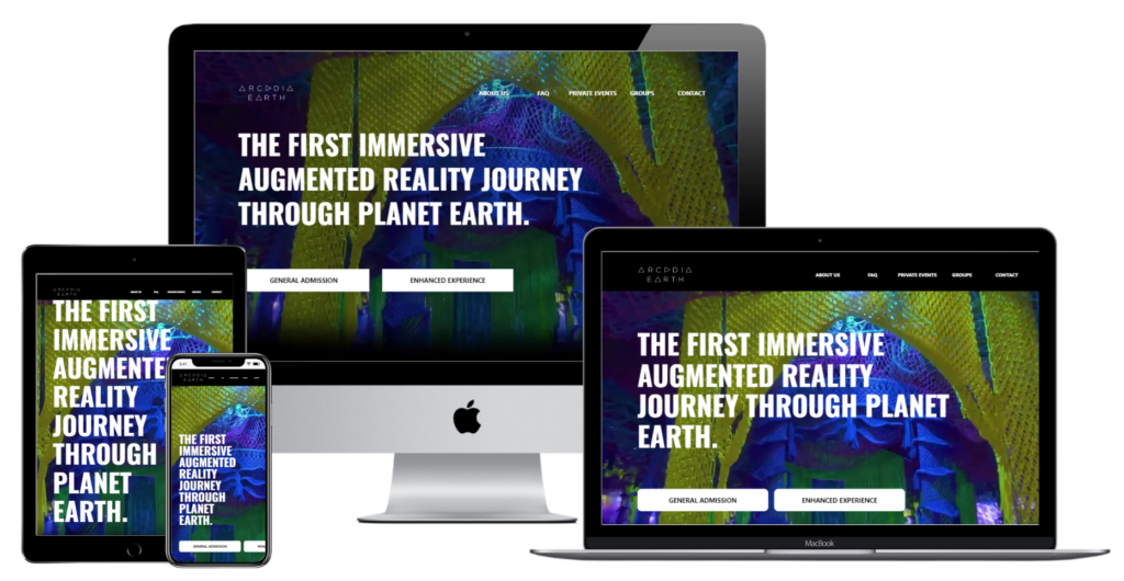
Arcadia Earth is a multimedia experience based on depicting the various ecosystems of planet Earth and how they are being impacted by environmental issues, as well as educating patrons on how we can take steps towards a more sustainable future.
Through a combination of videos that communicate the experience in various ways, to blunt titling that tells you everything you need to know, to an AR app that is made to complement the exhibits; Arcadia Earth’s website serves as the perfect informative introduction.
Space Perspective
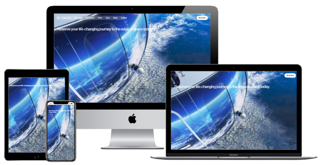
Space Perspective is an attraction like no other, promising to take tourists to space with incredible high-tech accommodation right out of a futurist’s wildest dreams. How do you sell the prospect of commercial space travel?
The answer is with a simple and clean design. The videos capture your imagination with the breathtaking views of the eponymous vessel floating through space, while the fonts and buttons (which are reminiscent of Apple’s incredibly smooth and elegant design principles) effortlessly guide you towards any information you need.
While we might not all have a cool $125,000 USD to drop on an interstellar stay, this website certainly makes us wish we did, that’s for sure.
Disneyland Paris
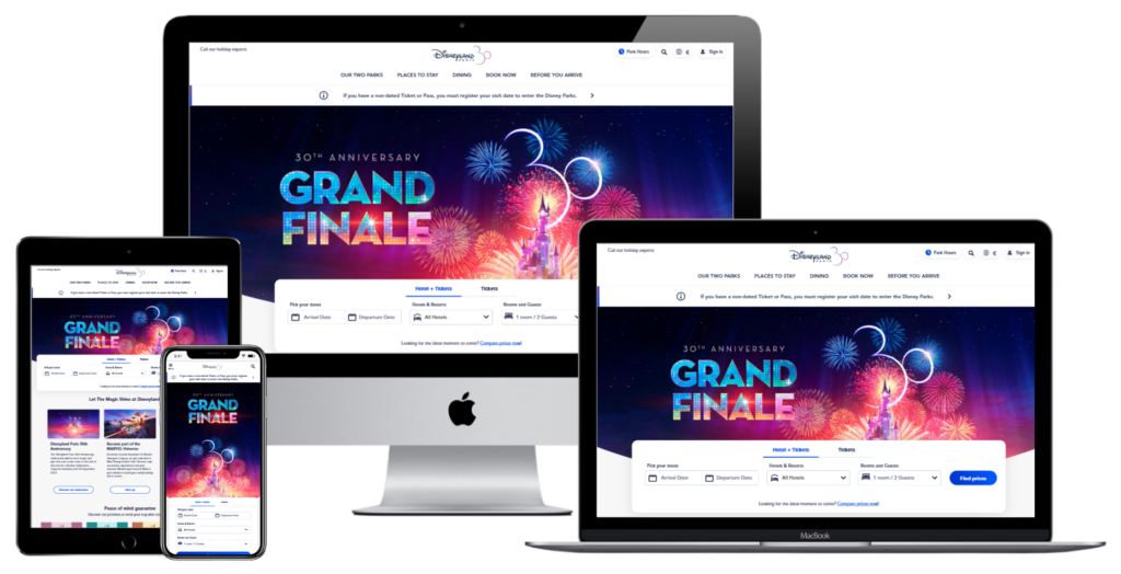
It certainly doesn’t take a genius to figure out that the website for one of the most popular theme parks of one of the largest media companies in the world has a great website. However, what really sets this website apart is in fact a subtle and often overlooked aspect of website design – structure.
This homepage starts by presenting you with why you should plan your next stay at Disneyland Paris by introducing some attractions (the park itself, the Marvel exhibitions, the hotel resort). Then, underneath that is booking information, followed by tips you need to plan out your stay (such as how to get to Disneyland, how to use their mobile app, how to get Premier Access, how to set a meal plan, etc.) Finally, you get to see specific attractions, and then you are led to ticket information where you are told everything you need to know to book your tickets.
Your website can have all kinds of impressive bells and whistles, but nothing beats a well planned layout that guides your users towards buying a ticket.
Tivoli Gardens
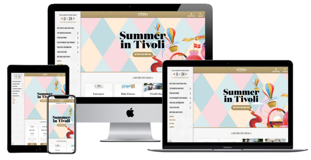
The first thing you see on this website for an incredibly popular amusement park in Denmark is the big bold words that say “Summer in Tivoli”, and summer is the word that sums this website perfectly.
The warm color-palette and the simple layout makes for a pleasant and inviting experience, providing visitors with quick access to important information such as ticket prices, park hours, and upcoming events.
Themes and motifs are ideas that have a tendency to fall to the wayside when you’re thinking of the logistics of a website. However, they are incredibly important. If you want your users to associate your website with nature and summer, you have to make them think of nature and summer.
Europa Park
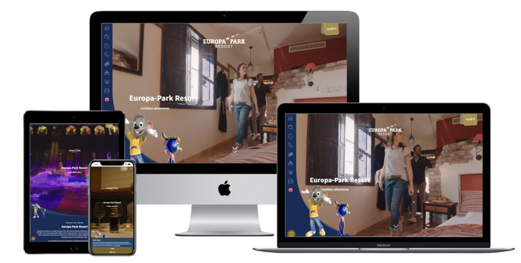
Is the mascot a little creepy? Yes. Is this a good example of website design for an amusement park? Also yes.
If you can look past the dead-eyed, vacant stare of the mouse as he gazes directly into your soul, you see an amusement park website that combines a lot of the different design principles that we’ve outlined throughout the previous entries.
The best part about this website however, is that the experience is as complicated as the user wants it to be. If you want, you can find links to all the information you need using the icons on the left side of the screen, such as the park areas, contact details, ticket information, etc.
But, if you don’t have a specific section in mind, you can simply scroll down for more information. You’ll also get a detailed explanation of everything mentioned above in easy to navigate sections.
Taronga Conservation Society
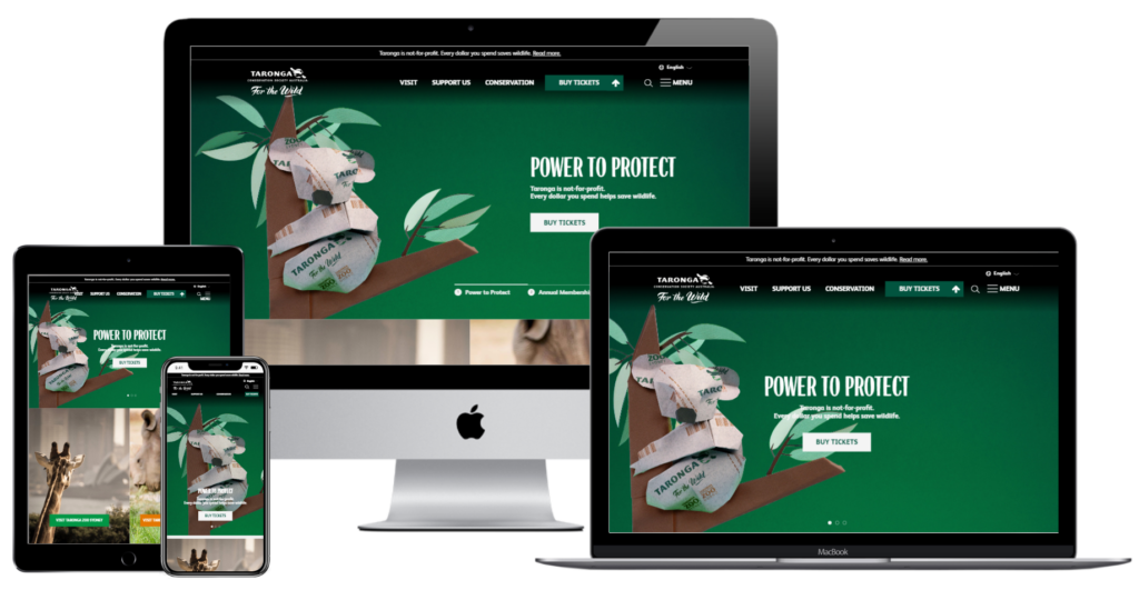
As this website tells you, Taronga is a non-for-profit organization dedicated to the conservation of Australian wildlife. Part of their conservation initiatives include both the Taronga Zoo in Sydney and the Taronga Western Plains Zoo in Dubbo.
This website is a perfect resource if you have any interest in attending one of these zoos, or even finding out more about conservation in general. The website is visually appealing with stunning images and videos of the animals and conservation work undertaken by the organization.
The site is easy to navigate with clear menus, and visitors can quickly access information about either zoo, as it is all neatly organized (and accompanied by high resolution images of some of the cutest animals you’ll ever see).
Luna Park Sydney
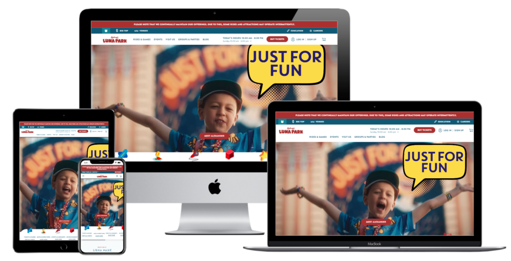
In Melbourne, we like to laud ourselves as better than Sydney. But, I have to admit, they have us beaten when it comes to Luna Park websites.
Both have easy navigation, both display their information really clearly, and both give you a sense of the kind of experience you’re going to have if you decide to walk into that giant gaping mouth entrance.
However, remember what we said earlier about themes and motifs? The thing about the Melbourne website is… well… it’s a little plain, isn’t it? Look at the Sydney website, and you get a great use of graphics and icons that combine modern website design with the classic imagery you’d associate with a fun fair.
Which sounds more attractive to you?
Currumbin Wildlife Sanctuary
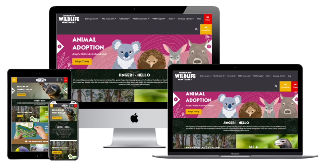
In a similar vein to Taronga, Currumbin Wildlife Sanctuary is a heritage-listed zoological garden in Queensland that is dedicated to both the preservation of the natural wildlife and sustainability education.
This website offers a lot in terms of information and education, with its homepage guiding you from an acknowledgement of the traditional owners, to a briefing on the attractions and shows, to an app that also serves as an interactive map that lets you plan your trip, profiles for all the available animals, etc.
Not only are all these elements eye-catching, showcasing the vibrancy of Australia’s very own flora and fauna, but they’ve been laid out so that the site is easy to navigate and use.
Dreamworld
Dreamworld is a very popular Australian amusement park. With a website like this, it’s easy to imagine why.
It’s bold.
The entire website is loaded with bold primary colors and bright and saturated images. Everything is designed to be in your face. Now, you’d think a design like that might be overwhelming and therefore counterintuitive, right?
And yet, this website has a fairly simple layout. All the elements are grouped together in a way that makes it easy to find what you’re looking for; whether you’re looking for the right day pass, you’re sorting through attractions to plan your day, or you just want to learn more about what’s available.
PortAventura World
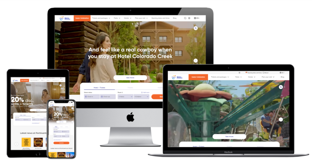
This Spanish entertainment resort might not have the flashiest or most colorful website, but it excels at one particular design principle that is very important for amusement parks and attractions and that is scalability.
People use a lot of devices nowadays. You have to make sure that your website works well on computers, laptops, tablets, phones, etc. How exactly you do that is by making sure that your elements are resizable without compromising their effectiveness.
The “latest news” section, where each of the articles are presented with square cover images that resemble mobile app tiles, and there are sliders that are used for the rest of the sections. When you couple these design choices with the large margins and extensive white space of the homepage; the end result is a simple website that is infinitely scalable.
LEGOLAND® New York
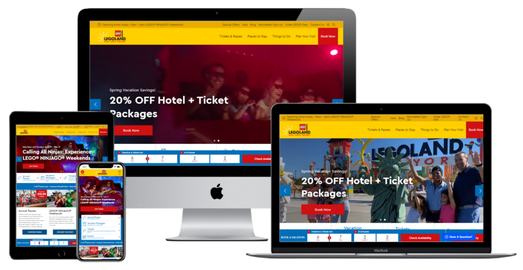
How do you make a website to sell an amusement park dedicated entirely to Lego, one of the most recognizable brands on the planet?
Well, if you ask any of the people that worked on the website for Legoland New York, they’d probably tell you that they followed the ethos of Lego itself, with a website that’s as colorful but also with a structured layout that resembles a series of blocks.
Is it the most elaborate way to design a website? Absolutely not. But, it’s effective. While your audience likely needs an instructional manual to complete a Lego set, they shouldn’t need one to buy tickets to your park.
Keep your target audience in mind. They are the ones that matter at the end of the day.
Busch Gardens
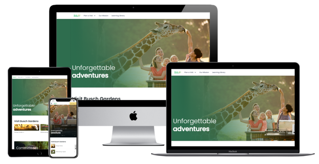
Now that we’ve talked about the target audience, let’s talk about your website’s purpose.
For example; we know what every website in this list hopes to accomplish. They exist to attract potential customers and encourage them to buy a ticket to their amusement park/attraction. However, these different establishments all have their own purpose that the website needs to communicate.
For example, Busch Gardens is another attraction on this list that is a wildlife sanctuary dedicated to wildlife conservation. The kind of enjoyment you’re going to get from a place like this is not the same kind of adrenaline-fuelled thrill ride that you’d get from a standard amusement park.
This is reflected on the website itself, which has a simple design and a limited color scheme mostly centered around white space and different shades of green. The website lets you select which park you want the details for (between Tampa, Florida and Williamsburg, Virginia); but underneath is a section outlining the Gardens’ mission statement, as well as learning materials related to conservation.
So, don’t just think about how you’re going to reach your audience. Keep in mind why you’re reaching them in the first place.
Cedar Point
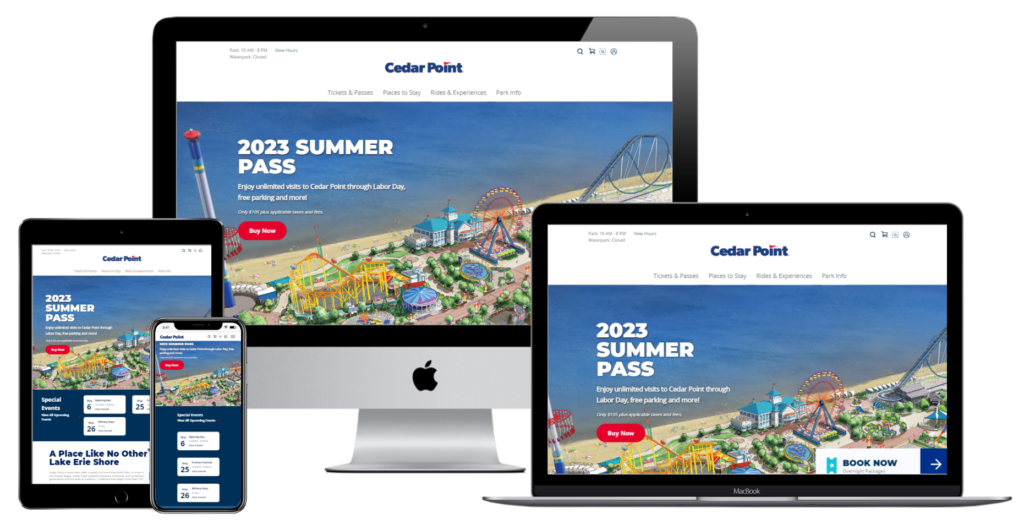
This website’s a great one because it covers everything we’ve talked about in this article.
The design is clean, but the images used are vibrant and colorful. All the information you need is laid out clearly, but it is done so in a way that uses space adequately for scalability. The structure makes sense for seamless navigation; introducing the park, then detailing the different attractions, extra activities and, finally, a guide on planning your visit with a call-to-action.
This website is a simple case study on all the different web design techniques you use to create a website that go beyond aesthetics. Do you want your website to look good? Sure. But, in an age where content management systems have become incredibly sophisticated, that’s not hard.
Functionality, purpose, communication – all of these are equally important, and they make the difference between an okay website and one that truly works.
Old Melbourne Gaol
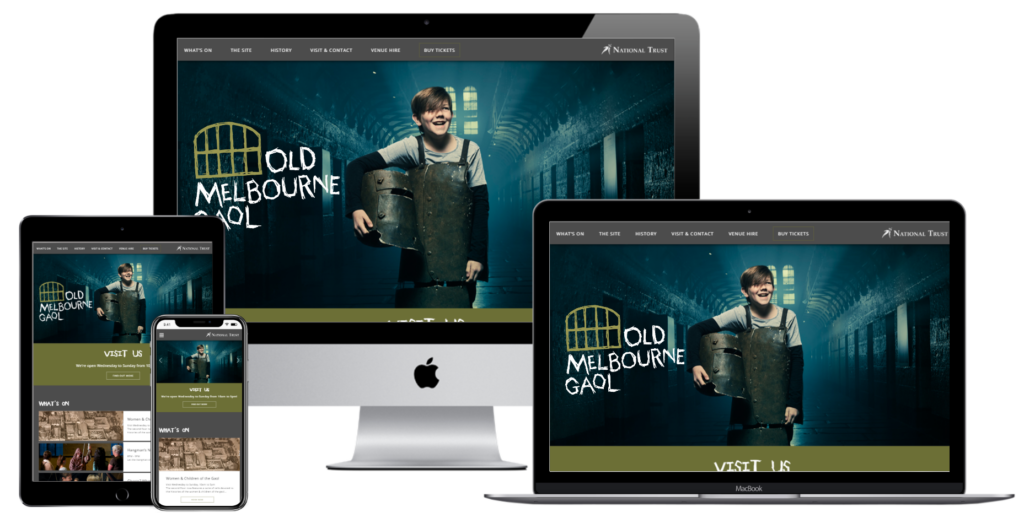
I had to finish with this website because it’s certainly got character. In case you don’t know, Old Melbourne Gaol is the oldest jail in Melbourne, having been established in 1845. It was converted to a museum in 1957, but it certainly has quite the history. Let’s just say, thanks to the many executions that took place (including Ned Kelly himself), it has a reputation for being haunted.
How do you know it has that reputation? Because this website is creepy with a capital C. The scratchy font, the ominous pictures, the black-and-white photos and the constant references to ghosts all hammer home that this is not your typical museum.
We do love a website with personality, don’t we?
What are the latest trends for amusement park and attraction websites?
As technology improves and becomes more accessible, amusement park businesses are adopting certain trends to create a better experience for their customers.
This includes attracting them to the website, guiding them through all the available attractions, making the process of ticket purchasing as easy as possible and encouraging social media interaction.
These trends include:
Virtual tours
Virtual tours are becoming increasingly popular as they allow potential visitors to explore the park from the comfort of their own homes. These virtual tours are typically created using 360-degree cameras and offer a fully immersive experience.
Visitors can move around the park and explore different areas, including rides, attractions, and facilities, as if they were actually there. They can also interact with certain elements, such as clicking on a ride to see a video of what it’s like to ride it or clicking on a facility to learn more about it.
Personalized experiences
Personalized experiences involve tailoring the visitor’s experience to their individual preferences and needs as they browse the website.
For example, a park might offer customized itineraries based on the visitor’s age, interests, and past visit history. This can help visitors make the most of their time at the park and ensure they don’t miss any of the attractions they’ll enjoy most.
Another way that personalized experiences are used is through recommendations. Based on the visitor’s past behavior, such as rides they’ve gone on before or food they’ve ordered, the website can suggest other attractions or food options that they might enjoy.
Device-scalable design
Nowadays, with the sheer amount of wireless devices that are available, amusement parks and attractions need to accommodate users that are accessing their website both at home on the computer and inside the amusement park.
Because of this, device-scalable design is a crucial part of amusement park and attraction websites. This type of design ensures that the website looks and functions well on all devices, including desktops, tablets, mobile phones and even some smartwatches.
This can include features such as larger font sizes, simplified navigation menus, and responsive design elements that adapt to different screen sizes. That way, patrons can make purchases, select rides and access information whenever and wherever they want.
Social Media Integration
Social media integration is used on amusement park and attraction websites in several ways.
Firstly, the websites feature links to the park’s social media accounts, allowing visitors to follow and engage with the park online. This helps to build a sense of community around the park and keep visitors informed about upcoming events and promotions.
Secondly, parks use social media feeds on their websites to display user-generated content, such as photos and videos taken by visitors. This allows potential visitors to see real-life experiences and get a feel for what the park has to offer.
Thirdly, some parks offer incentives for visitors to share their experiences on social media. This can include discounts on merchandise or tickets, or the chance to win prizes. This encourages visitors to share their experiences online and spread the word about the park to their followers.
Interactive maps
Interactive maps are a great feature of amusement park and attraction websites. They provide visitors with an easy-to-use guide to the park, allowing them to navigate their way around and find the attractions and facilities they are interested in.
Some of the key features of interactive maps on amusement park websites include the ability to zoom in and out, search for specific attractions or facilities, view wait times for rides, and access information about shows and events.
Interactive maps can also be used to help visitors plan their day at the park, by highlighting popular attractions, providing estimated wait times for rides, and suggesting nearby dining and shopping options.
Augmented reality (AR)
Augmented Reality (AR) technology is being used in various ways on amusement park and attraction websites.
One way is to provide visitors with an interactive and immersive experience by adding digital content to the physical world. This can include virtual queues, interactive ride experiences, and games that utilize AR technology.
Some amusement parks are also using AR to enhance their marketing efforts by allowing visitors to see a virtual representation of attractions and experiences before they arrive.
Additionally, AR can be used to provide visitors with additional information and insights about the park, such as historical or educational content.